The Aunt Jemima brand and logo will be retired

  • Thread starter Thread starter TK421
  • Start date Start date
Status
Not open for further replies.
T

TK421

Guest

Quaker Oats is retiring the more than 130-year-old Aunt Jemima brand and logo, acknowledging its origins are based on a racial stereotype.

“As we work to make progress toward racial equality through several initiatives, we also must take a hard look at our portfolio of brands and ensure they reflect our values and meet our consumers’ expectations,” the company said in a statement first obtained by NBC News.

Aunt Jemima’s appearance has evolved over time. The brand’s origin and logo is based off the song “Old Aunt Jemima” from a minstrel show performer. The company’s website said the logo started in 1890 and was based on Nancy Green, a “storyteller, cook and missionary worker.” The Aunt Jemima brand was purchased by Quaker Oats in 1926. PepsiCo bought Quaker Oats in 2001.

There have been repeated calls for the company to change the logo. In 2017, the husband of the late B. Smith called on the company to change it and said it was the epitome of “female humiliation.”
 
Quaker Oats is retiring the more than 130-year-old Aunt Jemima brand and logo, acknowledging its origins are based on a racial stereotype.
how is this a racial stereotype? You might as well claim that Granny Smith apples are a stereotype.
 
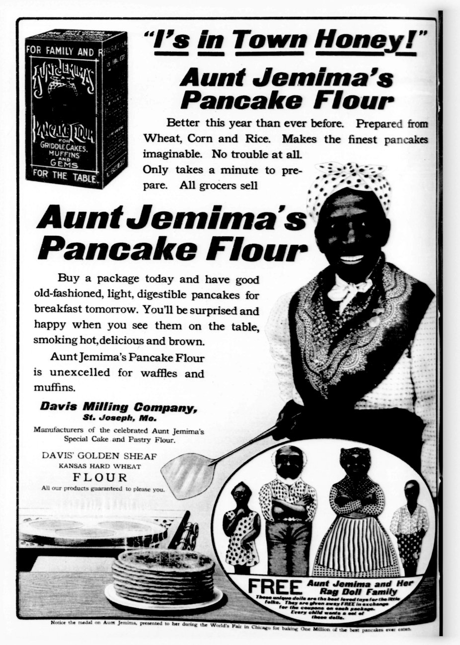
Look up the history of the logo, advertising, and how the character used to look. It was 100% a racist stereotype of a mammy type person.

(Please Note: This uploaded content is no longer available.)
 
Cream of Wheat is another, that image can probably be canned though, it’s offense would seem to be more in showing an African American in the job as chef… but wait a minute, whites are shown sometimes as chefs too… I once researched the very origins of Cream of Wheat (off topic) and it is interesting. I even visited their old office building, it may be closed now. They might have been merged.

Uncle Ben’s rice is a good example to bring up too, with brown rice having become fashionable, I have purchased quite a bit of it.

But where does it end? “Canoe” is a MN brand of wild rice. Does even having a canoe image on the can constitute some sort of stereotype? We know “Land of Lakes” changed their logo.

The Quaker on Quaker oats… let’s just say, there’s a lot of all of this on the market, frozen burritos from Don Jose or whatever that company is called…where’s the line?
Look up the history of the logo, advertising, and how the character used to look. It was 100% a racist stereotype of a mammy type person.
May have been racist at that time, may not be racist with the new image.

Times have been different, we all need to work together.

I also think a total examination of the problem needs to be made, not just half-way examinations and then, determining that the system is racist. Let’s look at everything.
 
Last edited:
The Quaker on Quaker oats… let’s just say, there’s a lot of all of this on the market, frozen burritos from Don Jose or whatever that company is called…where’s the line?
It won’t end until all your advertising and brands are text only. No logos, characters, or people.
 
Reminds me of the film They Live where all the food products simply had the words Obey and the like on them.
 

Enjoy!​

(Please Note: This uploaded content is no longer available.)
 
Last edited:
I fail to see why it is so problematic to Catholics when trying to be charitable to our brothers and sisters of color. Why so resistant? Why not err on the side of charity? Why get so bent out of shape if a brand decides do change their image to something more sensitive?
 
Last edited:
how is this a racial stereotype? You might as well claim that Granny Smith apples are a stereotype.
You must not remember the original logo. It was disgusting. I thought so even when I was little kid.
 
Why get so bent out of shape if a brand decides do change their image to something more sensitive?
Because @McDale721 nobody knows where that goalpost is! This isn’t as simple as a name change or character redesign. We’re at a point where advertisers and brands will be concerned about having anyone on their packaging.
 
They can call the rebranded syrup, “Get your own breakfast! I’m through working in the kitchen!”
 
I don’t know… Seems like a loaded statement. Might just leave the bottle blank.
 
Last edited:
Status
Not open for further replies.
Back
Top