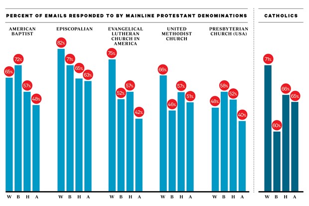
Oh I understand what you’re getting at now, thanks for the clarification. I disagree though that this is actually bad form in representing the data. I’m no social scientist so I have no idea if they labor under different SOPs than physical and life scientists do, but we frequently try to make the most use out of a graph’s space. This includes altering how much of a scale is shown (in this case it’s altering what percentage will be shown as the y-axis maximum). This isn’t in any way duplicitous, rather its a technique used to show clear differences
between data sets.
Take the chart comparing Mainline Protestants to Evangelicals. The maxim is at about 70%
because the largest datum in either set is 67%. Keeping the scale to 100% would render a lot of blank white space in the chart and would make an immediate observation of the graph difficult to compare the relative racial bias differences between the two sets (Mainline vs. Evangelical). The result is the same: If you were to plot a trendline over both sets of data the Mainline data would have a diagonal line (showing bias) while the Evangelical data would have a nearly perfect horizontal line (zero slope, showing nearly zero bias). Switching the y-axis maximum to 100% would minimize the slopes of
both lines making the difference between the two more difficult to ascertain, and making the Evangelical trendline appear to have a slope
even more closer to zero.
What I wish more pop articles with graphs would start doing is showing the error bars!!!

Doing so would clearly show which differences are statistically significant and which aren’t. Take the same chart I was just mentioning: There’s an observed difference between Evangelical response to White emails versus Asian emails (59% vs. 56%, respectively). An error bar accompanying the data bars would tell us immediately if the measurement uncertainty was ± 2%, or ± 4%. If the former, then the difference is significant. If the latter, then there is no statistical difference between the two data.