Z
Zzyzx_Road
Guest
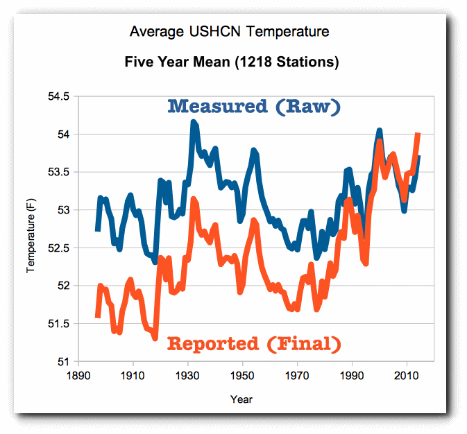
This cherry picking has taken place on BOTH sides. I’ve seen now how anyone can take the same raw data and fit it to the story they want to tell.That bogus/deceptive chart re temp anomalies is from C3 Headlines.
A blogger, Greenman (who at least gives his name on his site, which C3 Headlines does NOT), explains how C3 plays tricks with real data through cherry-picking, etc to make it look like CC is not happening, which apparently they do for many/all their deceptive charts–AND they don’t have the guts to reveal who they are.
Here’s what Greenman, Martin Porter, says about such a chart:
The source of the data, the very respectable National Space Science and Technology Centre, adds a touch of respectability…
So what’s the trick?
Well, the data isn’t made up. The original numbers are all here and, although it takes a bit of time to wade through them, the figures used on the chart are correct.
What’s been done is a bit of good old fashioned cherry picking. That’s easy enough to do, but what some eagle eyed denier has spotted is that the cherries that are worth picking lie at 5 year intervals. Neat.
thesnufkin.blogspot.in/2011/03/how-to-cook-data-set.html
There are many ways to lie and deceive – beware the deceptions!

") ).
).